Tutorial
Getting started
The first step to obtain a plot is always setting the engine. The way to do it is using
the set_engine function after importing.
import pyranges_plot as prp

# As engine use 'plotly' or 'ply' for Plotly and 'matplotlib' or 'plt' for Matplotlib
prp.set_engine("plotly")
Similarly, some other variables can be set prior to the plot call, like id_col,
warnings and theme; though unlike engine, they can be given as parameters to
the plot function.
Pyranges Plot evolves around the plot function, which admits output definition
through its parameters and additional appearance customization options. All the
parameters are explained in detail below, however to illustrate the options usage, the
following figure can be used as a cheat sheet. Note that these are not plot
parameters as such but can be given as kargs as well as pre-setting them, as
explained later on.

To showcase its functionalities we will load some example data included in the Pyranges Plot package, however Pyranges provides a series of data loading options like gff, gtf, bam… (take a look at Pyranges documentation to know more!).
p = prp.example_data.p1
print(p)
  index  |      Chromosome  Strand      Start      End  transcript_id    feature1    feature2
  int64  |           int64  object      int64    int64  object           object      object
-------  ---  ------------  --------  -------  -------  ---------------  ----------  ----------
      0  |               1  +               1       11  t1               a           A
      1  |               1  +              40       60  t1               a           A
      2  |               2  -              10       25  t2               b           B
      3  |               2  -              70       80  t2               b           B
      4  |               2  +              85      100  t3               c           C
      5  |               2  +             110      115  t3               c           C
      6  |               2  +             150      180  t3               c           C
      7  |               3  +             140      152  t4               d           D
PyRanges with 8 rows, 7 columns, and 1 index columns.
Contains 3 chromosomes and 2 strands.
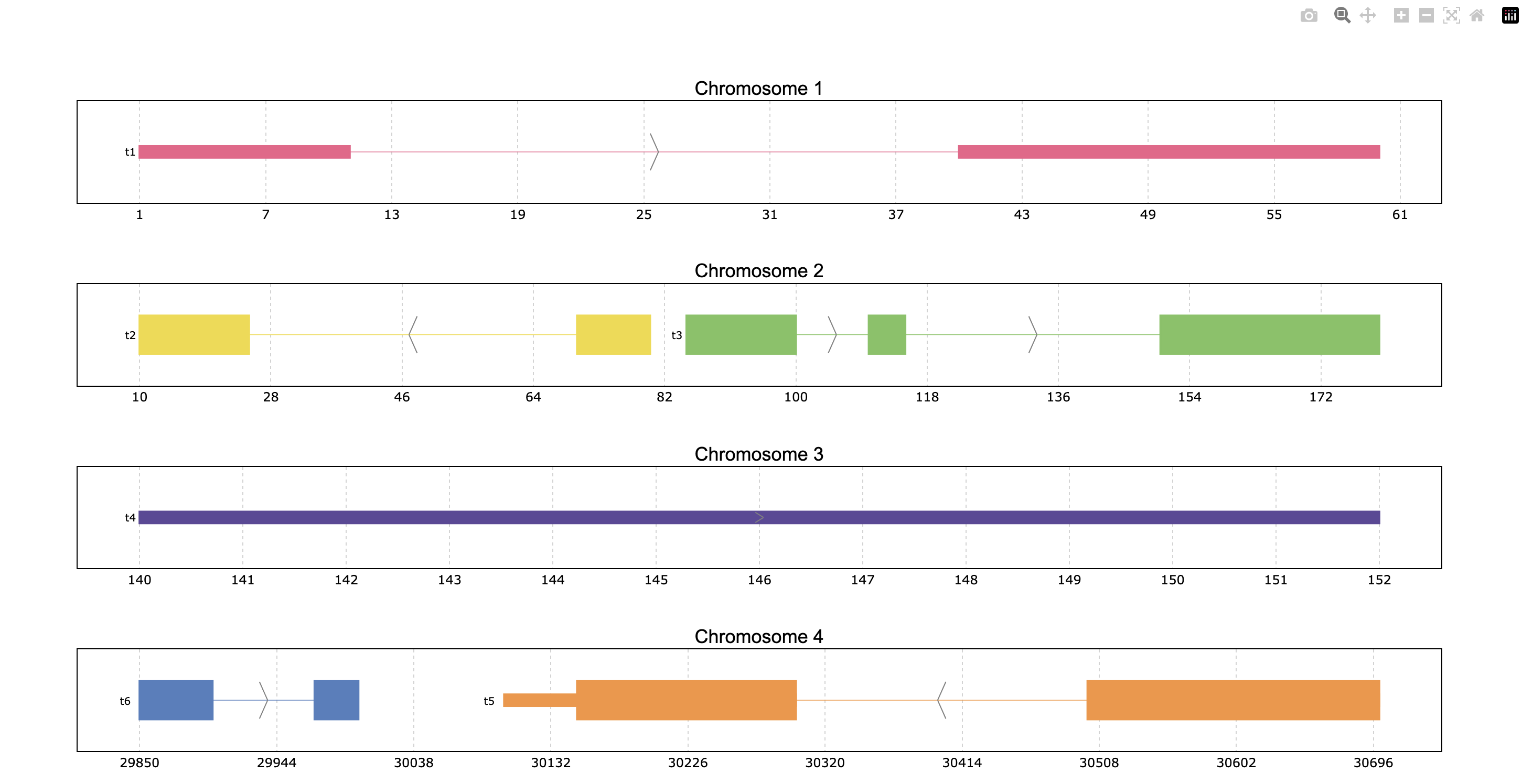
Once the set up is ready, a minimal plot can be obtained with just:
prp.plot(p)

The output will be an interactive plot by default, but it can also be a pdf or png file
if desired (as explained later in this tutorial). The image represents an interactive plotly
plot where the intervals are displayed individually because no id column has been specified.
To link the intervals, an id_column must be provided.
prp.set_id_col("transcript_id")
prp.plot(p)

# or alternatively prp.plot(p, id_col="transcript_id")

Playing with limits
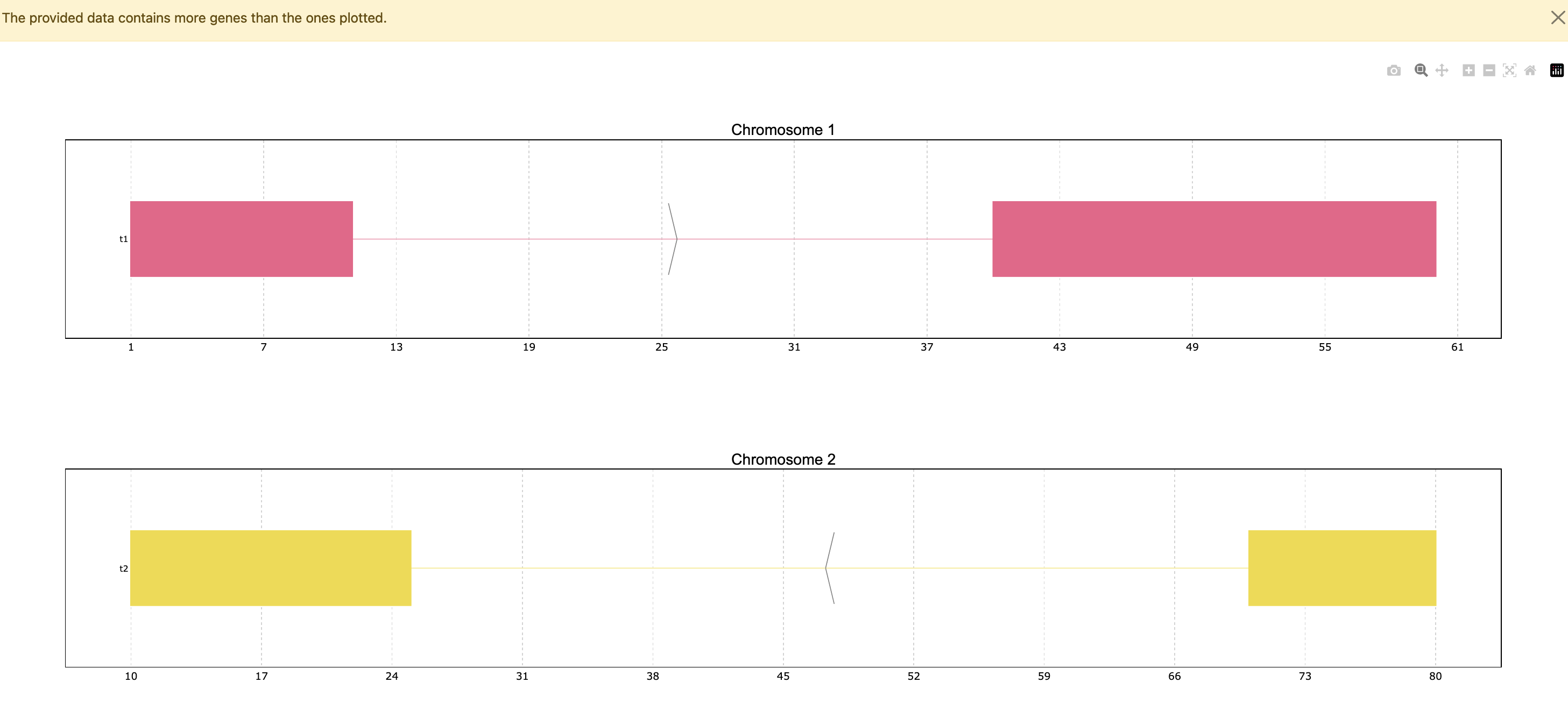
Since the data has only 4 genes all of them are plotted, but the function has a default
limit of 25, so in a case where the data contains more genes it will only show the top 25,
unless the max_ngenes parameter is specified. For example, we can set the maximum number of
genes as 2. Note that in the case of plotting less genes than the total amount in the data a
warning will appear.
prp.plot(p, max_shown=2)
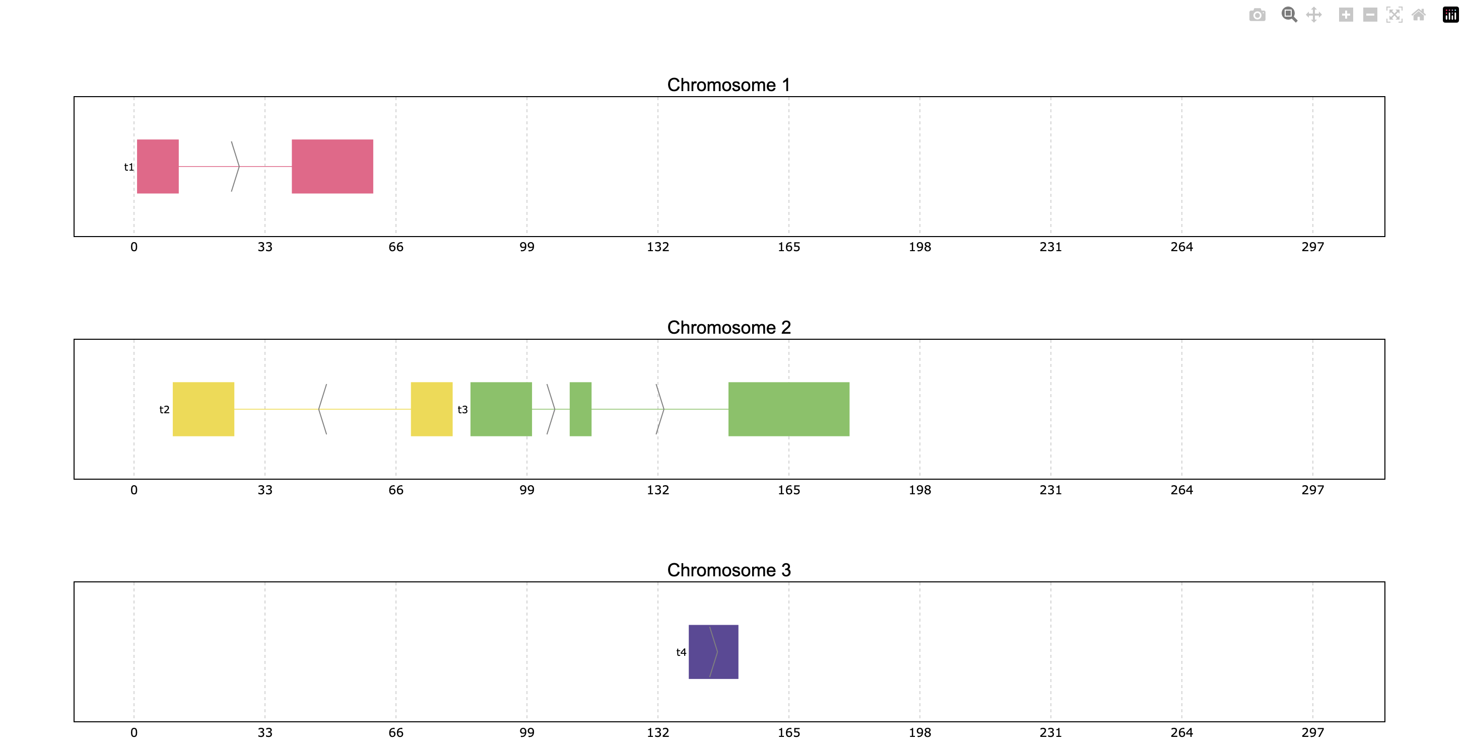
Another pyranges_plot functionality is allowing to define the plots’ coordinate limits through
the limits parameter. The default limits show some space between the first and last plotted
exons of each chromosome, but these can be customized. The user can decide to change all or
some of the coordinate limits leaving the rest as default if desired. The limits can be
provided as a dictionary, tuple or PyRanges object:
Dictionary where the keys should be the data’s chromosome names as string and the values can be either
Noneor a tuple indicating the limits. When a chromosome is not specified in the dictionary, or it is assignedNonethe coordinates will appear as default.Tuple option sets the limits of all plotted chromosomes as specified.
PyRanges object can also be used to define limits, allowing the visualization of one object’s genes in another object’s range window.
prp.plot(p, limits={1: (None, 100), 2: (60, 200), 3: None})
prp.plot(p, limits=(0,300))

Coloring
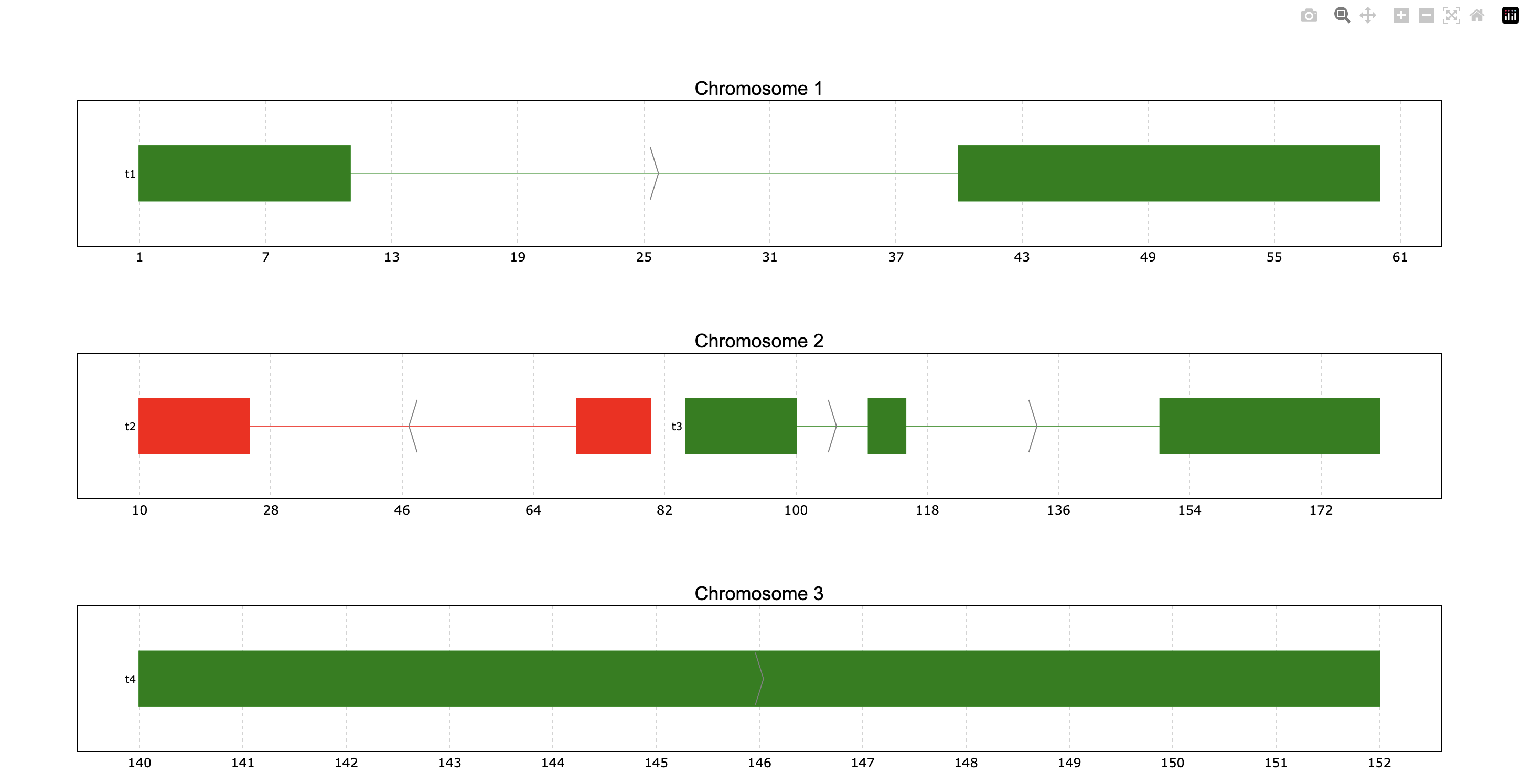
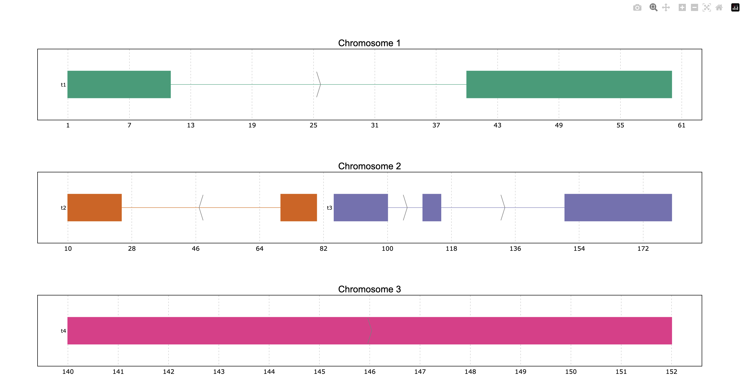
We can try to color the genes according to the strand column instead of the ID (default).
For that the color_col parameter should be used.
prp.plot(p, color_col="Strand")

This way we see the “+” strand genes in one color and the “-” in another color. Additionally,
these colors can be customized through the colormap parameter. For this case we can
specify it as a dictionary in the following way:
prp.plot(
    p,
    color_col="Strand",
    colormap={"+": "green", "-": "red"}
)
The parameter colormap is very versatile because it accepts dictionaries for specific
coloring, but also Matplotlib and Plotly color objects such as colormaps (or even just
the string name of these objects) as well as lists of colors in hex or rgb. For example,
we can use the Dark2 Matplotlib colormap, even if the plot is based on Plotly (all dependencies
must be installed):
prp.plot(p, colormap="Dark2")
Display options
The disposition of the genes is by default a packed disposition, so the genes are
preferentially placed one beside the other. But this disposition can be displayed
as ‘full’ if the user wants to show one gene under the other by setting the packed
parameter as False. Also, a legend can be added by setting the legend parameter
to True.
prp.plot(p, packed=False, legend = True)

In interactive plots there is the option of showing information about the gene when the
mouse is placed over its structure. This information always shows the gene’s strand if
it exists, the start and end coordinates and the ID. To add information contained in other
dataframe columns to the tooltip, a string should be given to the tooltip parameter. This
string must contain the desired column names within curly brackets as shown in the example.
Similarly, the title of the chromosome plots can be customized giving the desired string to
the title_chr parameter, where the correspondent chromosome value of the data is referred
to as {chrom}. An example could be the following:
prp.plot(
    p,
    tooltip="first feature: {feature1}\nsecond feature: {feature2}",
    title_chr='Chr: {chrom}'
    )

Overlaping intervals, +1 PyRanges and file export
In some cases, the data intervals might overlap. An example could be when some intervals in
the PyRanges object correspond to exons and others correspond to “GCA” appearances. For such
cases, the thickness_col and depth_col parameters are implemented.
Additionally, the plot function accepts more than 1 PyRanges object given as list,
and these inputs can be identified easily in the plot by using the y_labels parameter.
For this plot the thickness_col will be used to highlight the overlapping intervals.
This way some intervals will appear with a bigger height than others according to the
thickness column. Note that this column can only have 2 different values, as only 2 height
values are accepted.
# Store data
p_ala = prp.example_data.p_ala
p_cys = prp.example_data.p_cys

print(p_ala)
print(p_cys)

# Plot both PyRanges using depth to differentiate
prp.plot(
    [p_ala, p_cys],
    id_col="id",
    y_labels=["pr Alanine", "pr Cysteine"],
    thickness_col="trait1",
)
  index  |      Start      End    Chromosome  id        trait1    trait2      depth
  int64  |      int64    int64         int64  object    object    object      int64
-------  ---  -------  -------  ------------  --------  --------  --------  -------
      0  |         10       20             1  gene1     exon      gene_1          0
      1  |         50       75             1  gene1     exon      gene_1          0
      2  |         90      130             1  gene1     exon      gene_1          0
      3  |         13       16             1  gene1     aa        Ala             1
      4  |         60       63             1  gene1     aa        Ala             1
      5  |         72       75             1  gene1     aa        Ala             1
      6  |        120      123             1  gene1     aa        Ala             1
PyRanges with 7 rows, 7 columns, and 1 index columns.
Contains 1 chromosomes.

  index  |      Start      End    Chromosome  id        trait1    trait2      depth
  int64  |      int64    int64         int64  object    object    object      int64
-------  ---  -------  -------  ------------  --------  --------  --------  -------
      0  |         10       20             1  gene1     exon      gene_1          0
      1  |         50       75             1  gene1     exon      gene_1          0
      2  |         90      130             1  gene1     exon      gene_1          0
      3  |         15       18             1  gene1     aa        Cys             1
      4  |         55       58             1  gene1     aa        Cys             1
      5  |         62       65             1  gene1     aa        Cys             1
      6  |        100      103             1  gene1     aa        Cys             1
      7  |        110      113             1  gene1     aa        Cys             1
PyRanges with 8 rows, 7 columns, and 1 index columns.
Contains 1 chromosomes.

Another way to highligh these overlapping regions playing with colors and depth.This time the
plot will be exported to png instead of showing an interactive plot, for that the to_file
parameter will be used. Additionally, the color appearance of the plot will be customized by
providing the “dark” theme.
# Plot both PyRanges using interval thickness to differentiate
prp.plot(
    [p_ala, p_cys],
    id_col="id",
    y_labels=["pr Alanine", "pr Cysteine"],
    depth_col="depth",
    color_col="trait2",
    to_file="my_plot.png",  # file size can be specified in px by to_file=("my_plot.png", (500,500))
    theme="dark",
)

Show transcript structure
Another interesting feature is showing the transcript structure, so the CDS appear as wider rectangles than UTR regions. For that the proper information should be stored in the “Feature” column of the data. A usage example is:
pp = prp.example_data.p2

print(pp)

prp.plot(pp, thick_cds=True)
index    |    Chromosome    Strand    Start    End      transcript_id    feature1    feature2    Feature
int64    |    int64         object    int64    int64    object           object      object      object
-------  ---  ------------  --------  -------  -------  ---------------  ----------  ----------  ---------
0        |    1             +         1        11       t1               1           A           exon
1        |    1             +         40       60       t1               1           A           exon
2        |    2             -         10       25       t2               1           B           CDS
3        |    2             -         70       80       t2               1           B           CDS
...      |    ...           ...       ...      ...      ...              ...         ...         ...
10       |    4             -         30500    30700    t5               2           E           CDS
11       |    4             -         30647    30700    t5               2           E           exon
12       |    4             +         29850    29900    t6               2           F           CDS
13       |    4             +         29970    30000    t6               2           F           CDS
PyRanges with 14 rows, 8 columns, and 1 index columns.
Contains 4 chromosomes and 2 strands.
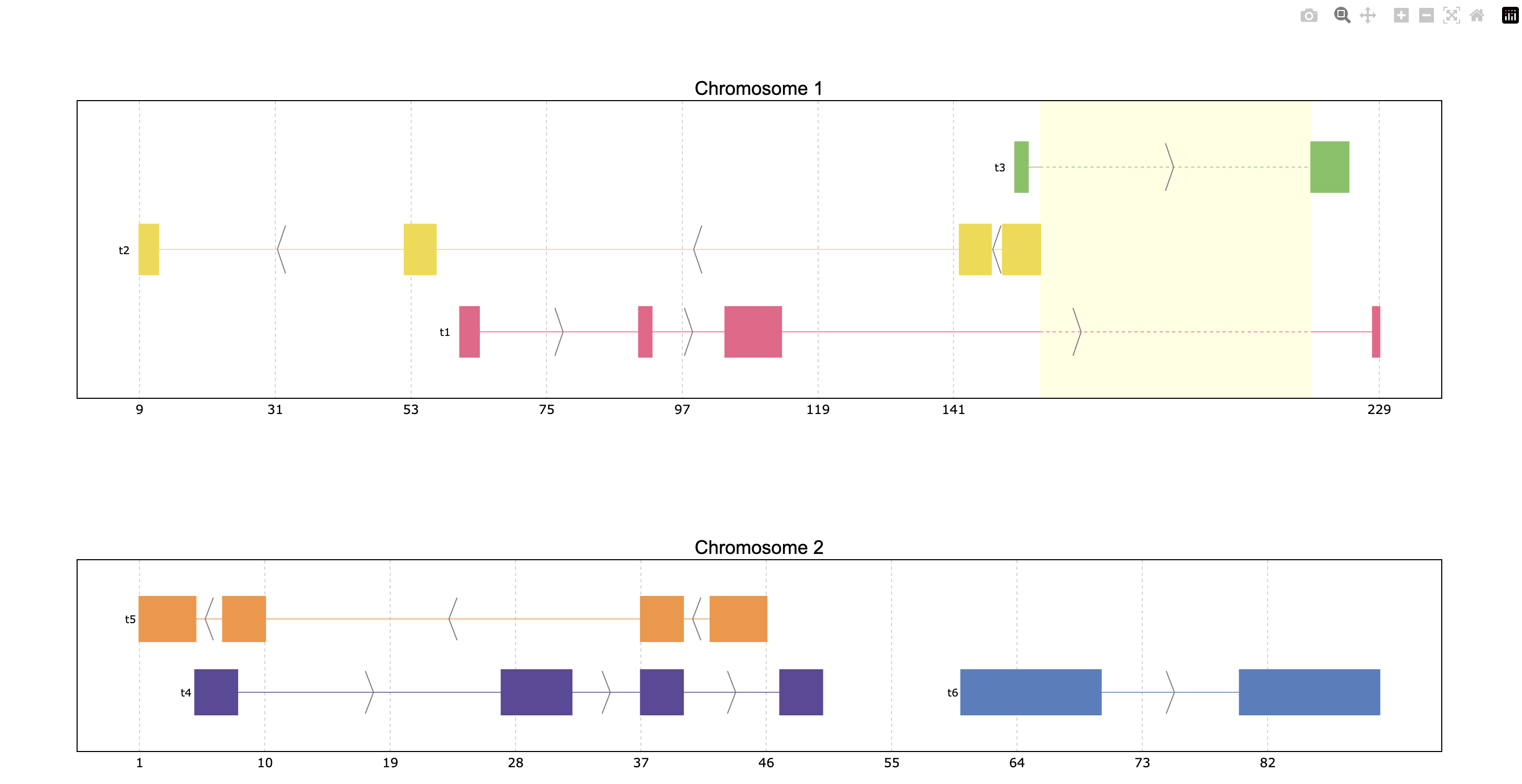
Reduce intron size
In order to facilitate visualization, pyranges_plot offers the option to reduce the introns
which exceed a given threshold size. For that the shrink parameter should be used.
Additionally, the threshold can be defined by the user through kargs or setting the
default options as explained in the next section using shrink_threshold, when a float
is provided as shrink_threshold it will be interpreted as a fraction of the original
coordinate range, while when an int is given it will be interpreted as number of base pairs.
ppp = prp.example_data.p3

print(ppp)

prp.plot(ppp, shrink=True)
prp.plot(ppp, shrink=True, shrink_threshold=0.2)
index    |    Chromosome    Strand    Start    End      transcript_id
int64    |    object        object    int64    int64    object
-------  ---  ------------  --------  -------  -------  ---------------
0        |    1             +         90       92       t1
1        |    1             +         61       64       t1
2        |    1             +         104      113      t1
3        |    1             +         228      229      t1
...      |    ...           ...       ...      ...      ...
16       |    2             -         42       46       t5
17       |    2             -         37       40       t5
18       |    2             +         60       70       t6
19       |    2             +         80       90       t6
PyRanges with 20 rows, 5 columns, and 1 index columns.
Contains 2 chromosomes and 2 strands.

Appearance customizations
There are some features of the plot appearance which can also be customized, like the
background color, plot border or titles. To check these customizable features and its
default options values, the print_options function should be used. These values can be
modified for all the following plots through the set_options function. However, for a
single plot, these features can be given as kargs to the plot function (see shrink_threshold
in the example above).
# Check the default options values
prp.print_options()
+------------------+-------------+---------+--------------------------------------------------------------+
|     Feature      |    Value    | Edited? |                         Description                          |
+------------------+-------------+---------+--------------------------------------------------------------+
|     colormap     |   popart    |         | Sequence of colors to assign to every group of intervals     |
|                  |             |         | sharing the same “color_col” value. It can be provided as a  |
|                  |             |         | Matplotlib colormap, a Plotly color sequence (built as       |
|                  |             |         | lists), a string naming the previously mentioned color       |
|                  |             |         | objects from Matplotlib and Plotly, or a dictionary with     |
|                  |             |         | the following structure {color_column_value1: color1,        |
|                  |             |         | color_column_value2: color2, ...}. When a specific           |
|                  |             |         | color_col value is not specified in the dictionary it will   |
|                  |             |         | be colored in black.                                         |
|   exon_border    |    None     |         | Color of the interval's rectangle border.                    |
|     fig_bkg      |    white    |         | Bakground color of the whole figure.                         |
|    grid_color    |  lightgrey  |         | Color of x coordinates grid lines.                           |
|     plot_bkg     |    white    |         | Background color of the plots.                               |
|   plot_border    |    black    |         | Color of the line delimiting the plots.                      |
|    shrunk_bkg    | lightyellow |         | Color of the shrunk region background.                       |
|     tag_bkg      |    grey     |         | Background color of the tooltip annotation for the gene in   |
|                  |             |         | Matplotlib.                                                  |
|   title_color    |    black    |         | Color of the plots' titles.                                  |
|    title_size    |     18      |         | Size of the plots' titles.                                   |
|     x_ticks      |    None     |         | Int, list or dict defining the x_ticks to be displayed.      |
|                  |             |         | When int, number of ticks to be placed on each plot. When    |
|                  |             |         | list, it corresponds to de values used as ticks. When dict,  |
|                  |             |         | the keys must match the Chromosome values of the data,       |
|                  |             |         | while the values can be either int or list of int; when int  |
|                  |             |         | it corresponds to the number of ticks to be placed; when     |
|                  |             |         | list of int it corresponds to de values used as ticks. Note  |
|                  |             |         | that when the tick falls within a shrunk region it will not  |
|                  |             |         | be diplayed.                                                 |
+------------------+-------------+---------+--------------------------------------------------------------+
|   arrow_color    |    grey     |         | Color of the arrow indicating strand.                        |
| arrow_line_width |      1      |         | Line width of the arrow lines                                |
|    arrow_size    |    0.006    |         | Float corresponding to the fraction of the plot or int       |
|                  |             |         | corresponding to the number of positions occupied by a       |
|                  |             |         | direction arrow.                                             |
|   exon_height    |     0.6     |         | Height of the exon rectangle in the plot.                    |
|   intron_color   |    None     |         | Color of the intron lines. When None, the color of the       |
|                  |             |         | first interval will be used.                                 |
|     text_pad     |    0.005    |         | Space where the id annotation is placed beside the           |
|                  |             |         | interval. When text_pad is float, it represents the          |
|                  |             |         | percentage of the plot space, while an int pad represents    |
|                  |             |         | number of positions or base pairs.                           |
|    text_size     |     10      |         | Fontsize of the text annotation beside the intervals.        |
|     v_spacer     |     0.5     |         | Vertical distance between the intervals and plot border.     |
+------------------+-------------+---------+--------------------------------------------------------------+
|   plotly_port    |    8050     |         | Port to run plotly app.                                      |
| shrink_threshold |    0.01     |         | Minimum length of an intron or intergenic region in order    |
|                  |             |         | for it to be shrunk while using the “shrink” feature. When   |
|                  |             |         | threshold is float, it represents the fraction of the plot   |
|                  |             |         | space, while an int threshold represents number of           |
|                  |             |         | positions or base pairs.                                     |
+------------------+-------------+---------+--------------------------------------------------------------+
Once you found the feature you would like to customize, it can be modified:
# Change the default options values
prp.set_options('plot_bkg', 'rgb(173, 216, 230)')
prp.set_options('plot_border', '#808080')
prp.set_options('title_color', 'magenta')

# Make the customized plot
prp.plot(p)

Now the modified values will be marked when checking the options values:
prp.print_options()
+------------------+--------------------+---------+--------------------------------------------------------------+
|     Feature      |       Value        | Edited? |                         Description                          |
+------------------+--------------------+---------+--------------------------------------------------------------+
|     colormap     |       popart       |         | Sequence of colors to assign to every group of intervals     |
|                  |                    |         | sharing the same “color_col” value. It can be provided as a  |
|                  |                    |         | Matplotlib colormap, a Plotly color sequence (built as       |
|                  |                    |         | lists), a string naming the previously mentioned color       |
|                  |                    |         | objects from Matplotlib and Plotly, or a dictionary with     |
|                  |                    |         | the following structure {color_column_value1: color1,        |
|                  |                    |         | color_column_value2: color2, ...}. When a specific           |
|                  |                    |         | color_col value is not specified in the dictionary it will   |
|                  |                    |         | be colored in black.                                         |
|   exon_border    |        None        |         | Color of the interval's rectangle border.                    |
|     fig_bkg      |       white        |         | Bakground color of the whole figure.                         |
|    grid_color    |     lightgrey      |         | Color of x coordinates grid lines.                           |
|     plot_bkg     | rgb(173, 216, 230) |    *    | Background color of the plots.                               |
|   plot_border    |      #808080       |    *    | Color of the line delimiting the plots.                      |
|    shrunk_bkg    |    lightyellow     |         | Color of the shrunk region background.                       |
|     tag_bkg      |        grey        |         | Background color of the tooltip annotation for the gene in   |
|                  |                    |         | Matplotlib.                                                  |
|   title_color    |      magenta       |    *    | Color of the plots' titles.                                  |
|    title_size    |         18         |         | Size of the plots' titles.                                   |
|     x_ticks      |        None        |         | Int, list or dict defining the x_ticks to be displayed.      |
|                  |                    |         | When int, number of ticks to be placed on each plot. When    |
|                  |                    |         | list, it corresponds to de values used as ticks. When dict,  |
|                  |                    |         | the keys must match the Chromosome values of the data,       |
|                  |                    |         | while the values can be either int or list of int; when int  |
|                  |                    |         | it corresponds to the number of ticks to be placed; when     |
|                  |                    |         | list of int it corresponds to de values used as ticks. Note  |
|                  |                    |         | that when the tick falls within a shrunk region it will not  |
|                  |                    |         | be diplayed.                                                 |
+------------------+--------------------+---------+--------------------------------------------------------------+
|   arrow_color    |        grey        |         | Color of the arrow indicating strand.                        |
| arrow_line_width |         1          |         | Line width of the arrow lines                                |
|    arrow_size    |       0.006        |         | Float corresponding to the fraction of the plot or int       |
|                  |                    |         | corresponding to the number of positions occupied by a       |
|                  |                    |         | direction arrow.                                             |
|   exon_height    |        0.6         |         | Height of the exon rectangle in the plot.                    |
|   intron_color   |        None        |         | Color of the intron lines. When None, the color of the       |
|                  |                    |         | first interval will be used.                                 |
|     text_pad     |       0.005        |         | Space where the id annotation is placed beside the           |
|                  |                    |         | interval. When text_pad is float, it represents the          |
|                  |                    |         | percentage of the plot space, while an int pad represents    |
|                  |                    |         | number of positions or base pairs.                           |
|    text_size     |         10         |         | Fontsize of the text annotation beside the intervals.        |
|     v_spacer     |        0.5         |         | Vertical distance between the intervals and plot border.     |
+------------------+--------------------+---------+--------------------------------------------------------------+
|   plotly_port    |        8050        |         | Port to run plotly app.                                      |
| shrink_threshold |        0.01        |         | Minimum length of an intron or intergenic region in order    |
|                  |                    |         | for it to be shrunk while using the “shrink” feature. When   |
|                  |                    |         | threshold is float, it represents the fraction of the plot   |
|                  |                    |         | space, while an int threshold represents number of           |
|                  |                    |         | positions or base pairs.                                     |
+------------------+--------------------+---------+--------------------------------------------------------------+
To return to the original appearance of the plot, the reset_options function can restore
all or some parameters. By default, it will reset all the features, but it also accepts a
string for resetting a single feature or a list of strings to reset a few.
prp.reset_options()  # reset all
prp.reset_options('plot_background')  # reset one feature
prp.reset_options(['plot_border', 'title_color'])  # reset a few features
PyRanges compatibility
To add the plot function to PyRanges objects, the function register_plot has been implemented.
It allows registering plot to enable pyranges.PyRanges.plot() calls. Its usage
is the following:
import pyranges_plot as prp

# Register plot function and define engine simultaneously
prp.register_plot("matplotlib")